
Color Wheel Basics
The color wheel is made up of different colors that can be grouped and organized based on how they relate to each other.
01
Primary Colors
The basic colors used to create other colors. For digital screens, these are red, green, and blue (RGB).
02
Secondary Colors
Colors created by combining two primary colors. In RGB, these are cyan, magenta, and yellow.
03
Tertiary Colors
Colors created by combining a primary and secondary color. Examples include orange, violet, and spring green.
04
Warm Colors
Warm colors include red, orange, and yellow. These colors often remind people of sunshine or fire and can make a design feel warm, energetic, or inviting.
Color Combinations
There are different ways to combine colors using the color wheel. Each combination creates a different look depending on where the colors are located and how they’re used together.
Complementary Colors
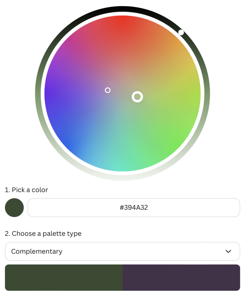
Complementary colors are two colors on opposite sides of the color wheel. When used together, they create a lot of contrast and make each color stand out more.
Monochromatic Colors
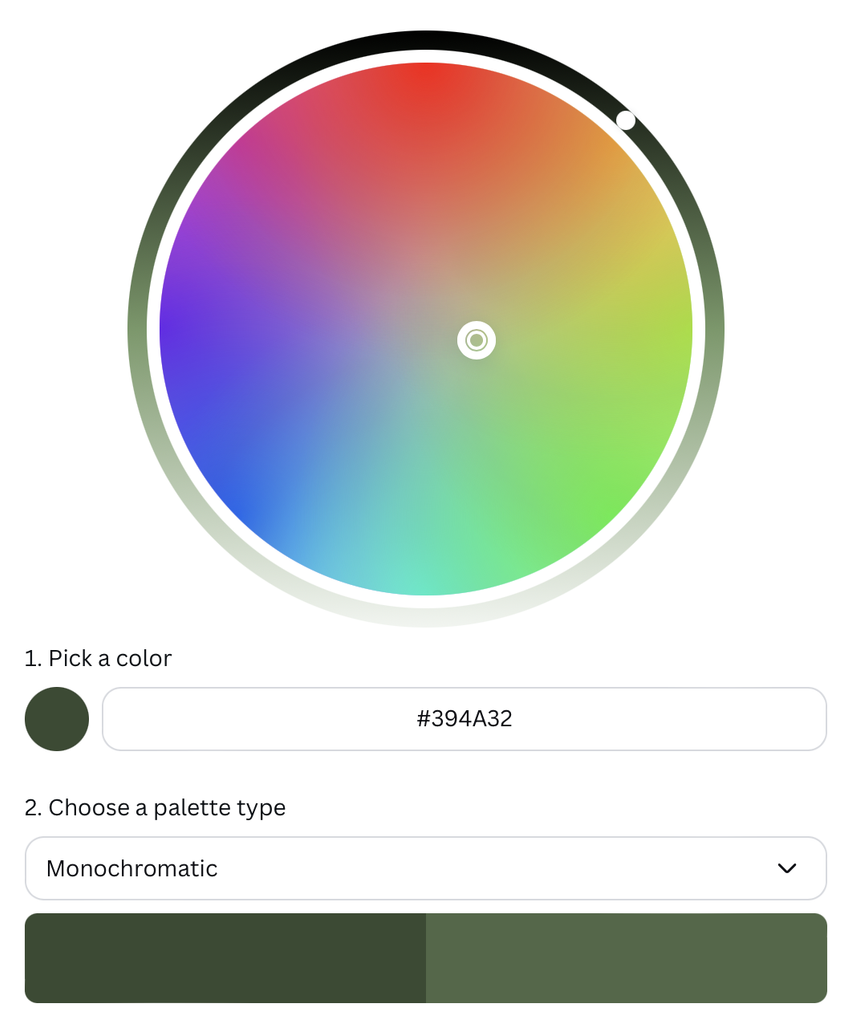
Monochromatic colors are different shades, tints, and tones of the same color. They work well together and create a simple, consistent look.
Analogous Colors
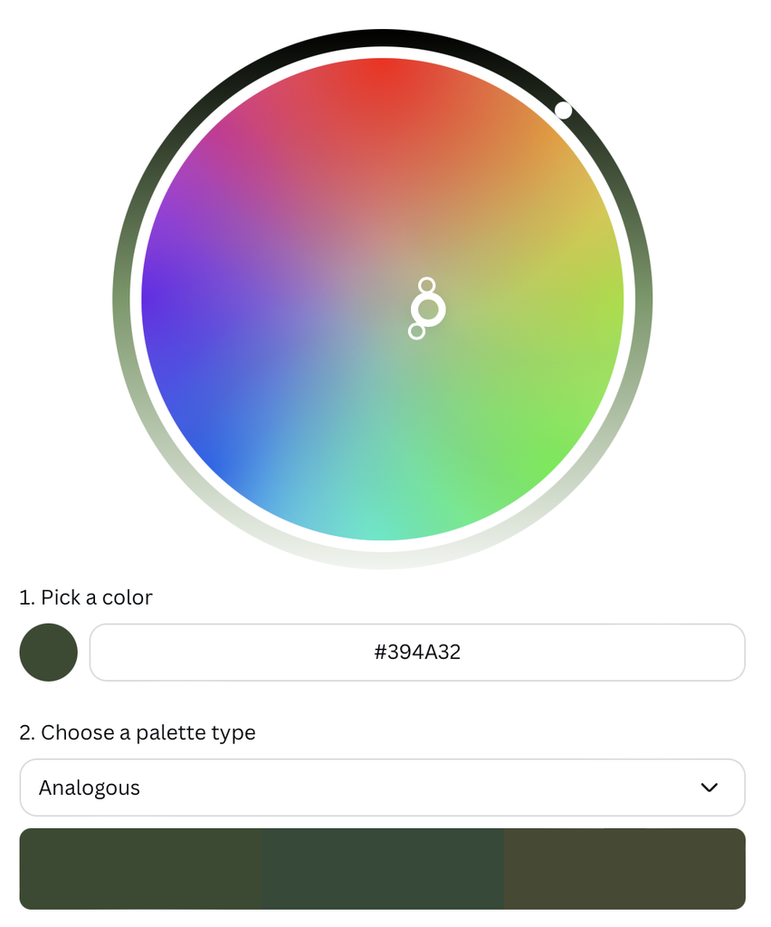
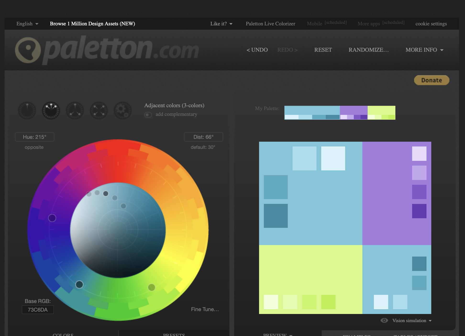
Analogous colors are three colors next to each other on the color wheel. They usually work well together, especially when one is the main color and the others are used as accents.
Triadic Colors
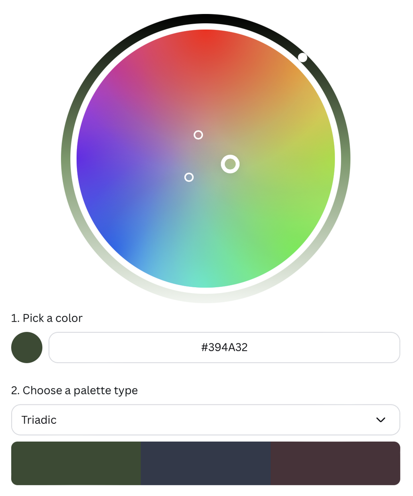
Triadic colors are three colors evenly spaced around the color wheel. They create a colorful, balanced look with plenty of contrast, but not as much as complementary colors.
Tetradic Colors
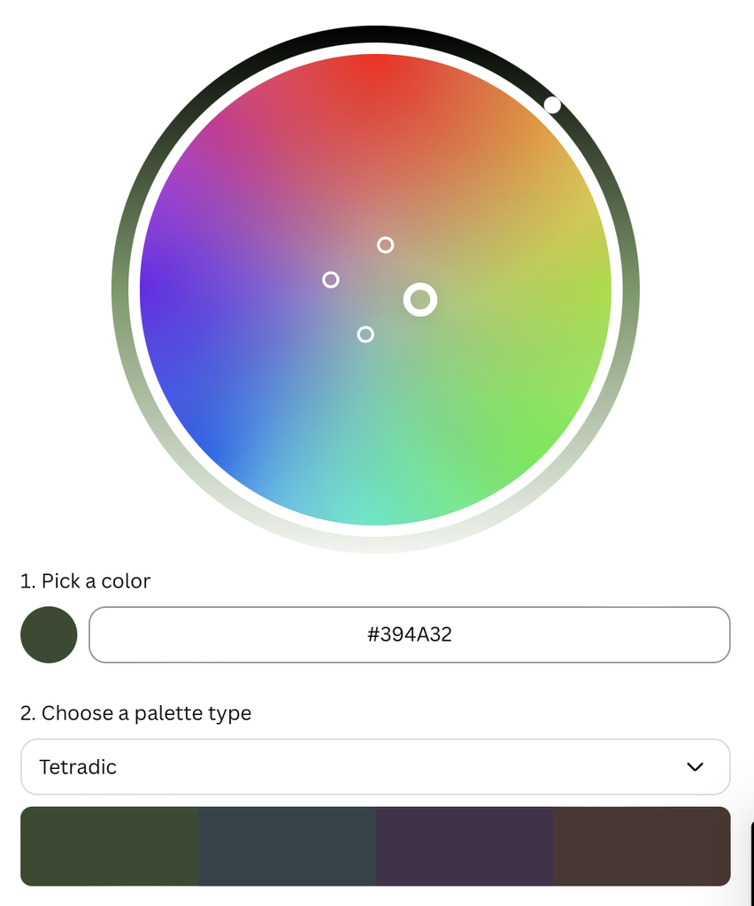
Tetradic colors are four colors evenly spaced around the color wheel. They can create bold designs, but using too many colors equally can make the design look overwhelming.
Color Properties
Colors can be adjusted to make them lighter, darker, brighter, or more muted. These changes can affect how colors look and feel in a design.
Shades, Tints, & Tones
Shades
Shades are created by adding black to a color, making it darker.
Tints
Tints are created by adding white to a color, making it lighter.
Tones
Tones are created by adding gray to a color, making it softer and less intense.
Hues, Saturation, and Luminance
Hue
Hue is the actual color, like red, blue, or green.
Saturation
Saturation is how strong or vibrant a color is.
Luminance
Luminance is how bright or light a color appears.
Exploring Colors Palettes
Exploring Color Palettes in Paletton
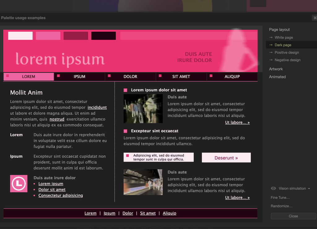
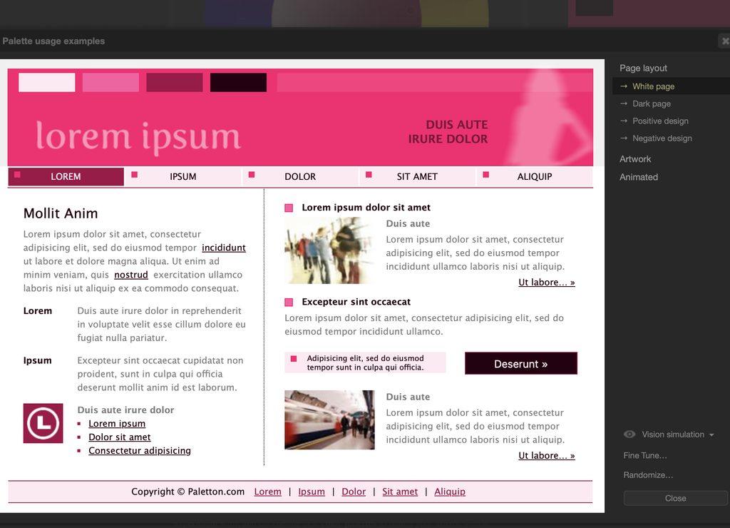
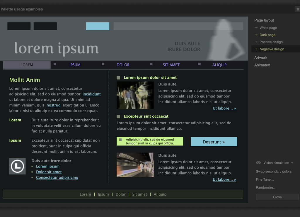
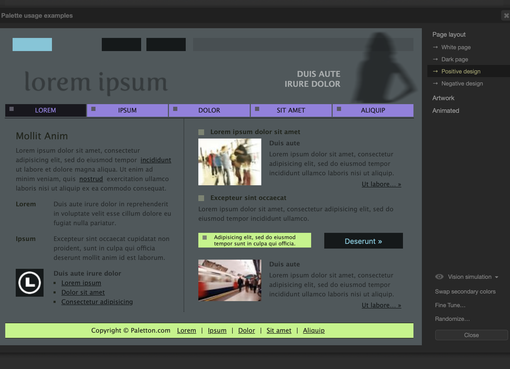
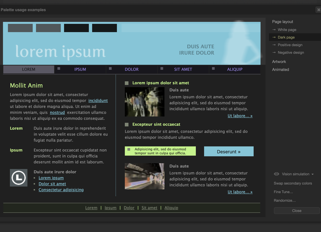
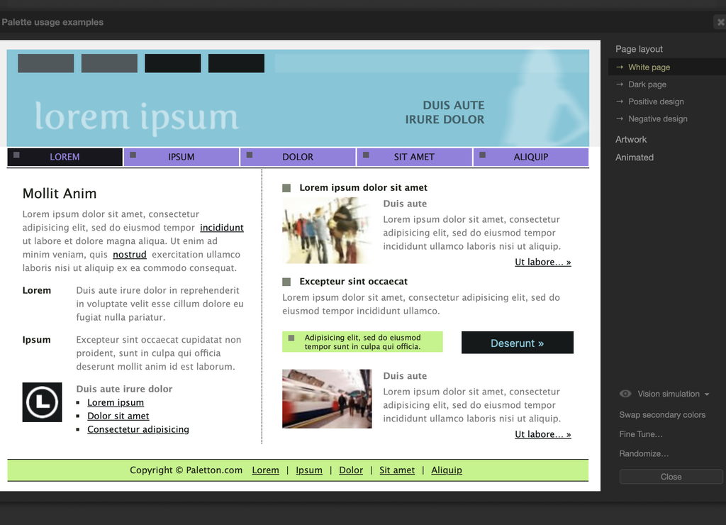
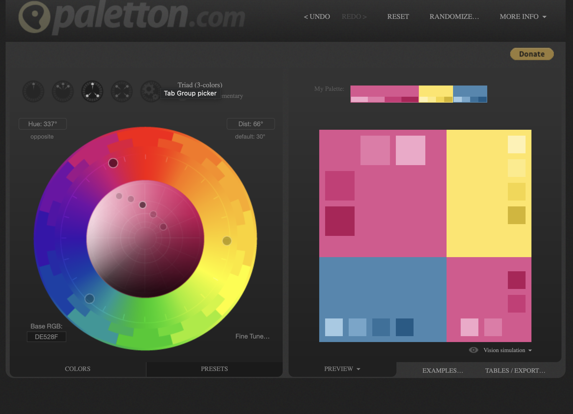
Using Paletton, I experimented with three different types of color palettes: monochromatic, adjacent, and triadic.
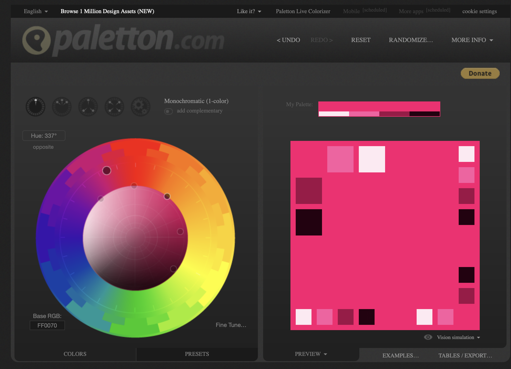
Monochromatic
Base Color #FF0070
View Page Layouts
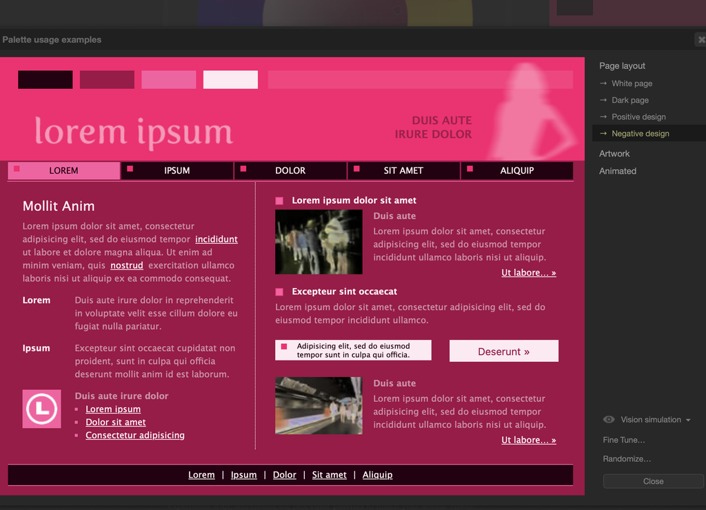
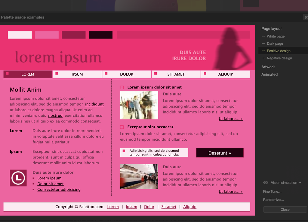
Adjacent
Base Color #73C7DA
View Page Layouts
Triadic
Base Color #DE5290
View Page Layouts
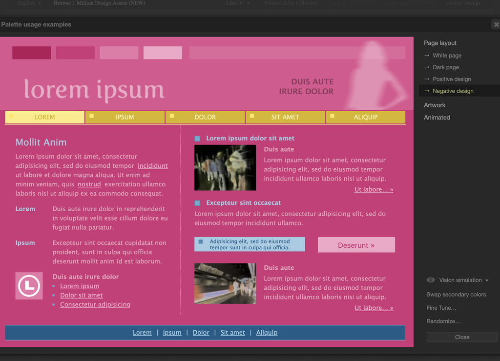
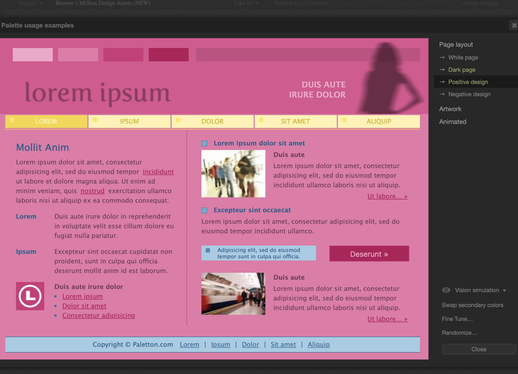
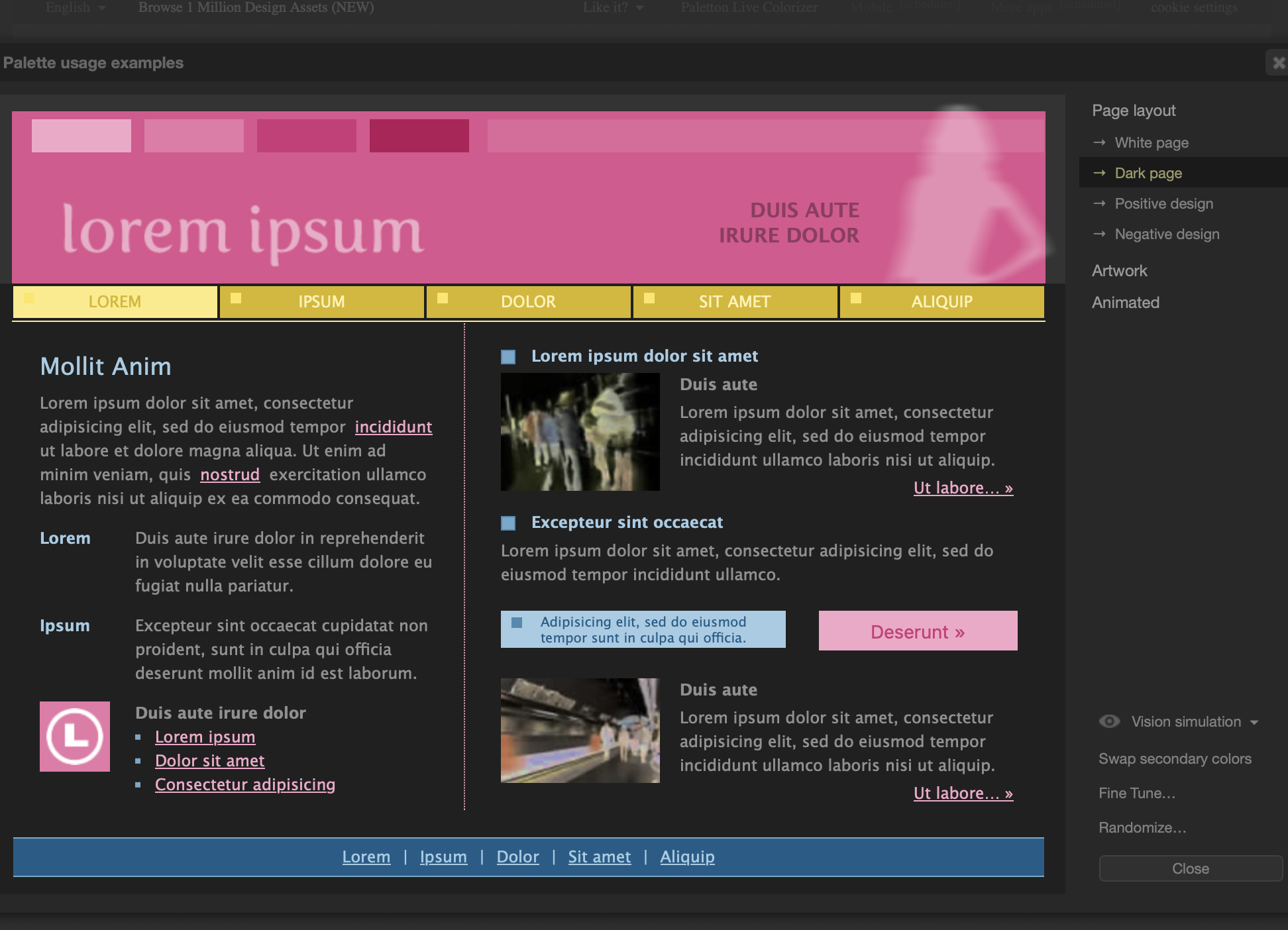
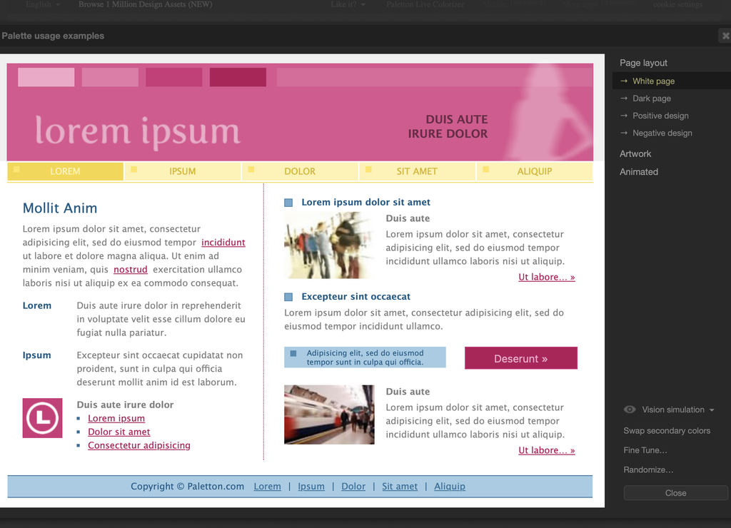
My Experience Using Paletton
I liked using Paletton to try out different color combinations. This was my first time hearing about it and using it. I liked the three palettes I chose, but I wasn’t really a fan of how they looked on the example websites.After looking at the different page layouts, I felt like there was too much color being used. I liked the lighter backgrounds with darker text because they were easier to read. I think the brighter colors would have looked better if they were used for smaller details instead of the whole page. It made me realize that just because colors look good together doesn’t mean they’ll look good on a website.
Canva Color Options
Exploring Color Combinations in Canva
After exploring Canva’s article, 100 Color Combinations, I chose three color palettes that stood out to me.
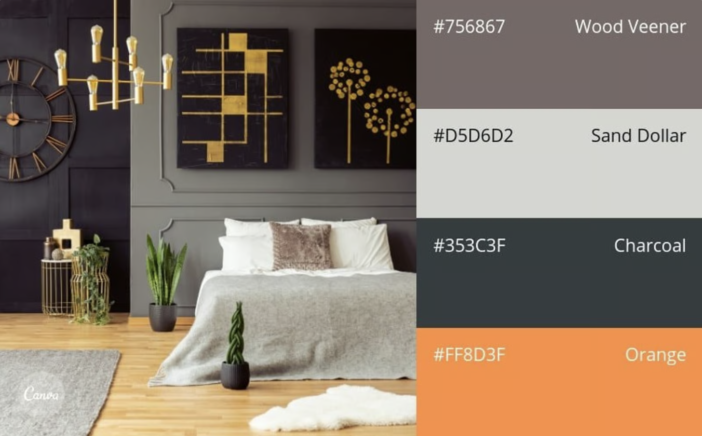
Orange Accent #78
I like how the orange stands out against the other colors without being too bright.
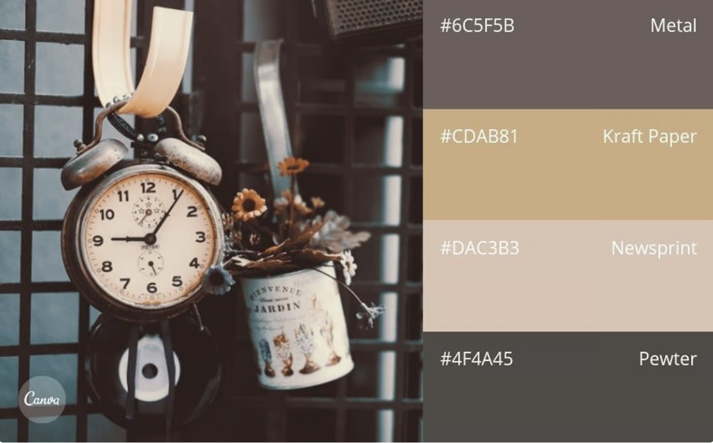
Shabby Chic Neutrals #80
I like the soft, neutral colors and how clean they look together.
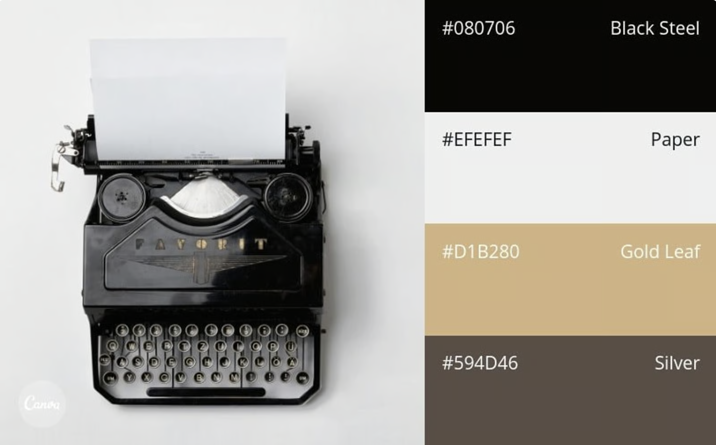
Classic Metallics #85
I like how the gold stands out against the darker colors.
Additional Resources

Color Picker Tool: How It Enhances Your Web Design Process
This article explains how color picker tools can make choosing colors for a website easier. It discusses finding colors that work well together, keeping a consistent design, and making sure text is easy to read.

Writing for Websites — Grammarly
This article gives tips for writing content for websites. It explains how headings, shorter paragraphs, and simple language can make a website easier to read and understand.